Every now and again you come across one of those tasks as a coder that should take 2 seconds of your time and yet somehow manages to take half a day. Trying to change the Material UI Appbar color was one of those today. The answer though, as ever, is very simple, but finding the answer was not. So the next time I’m online trying to find how to change the Mui Appbar color, hopefully this post will show up and save me (and hopefully you) a ton of time! The solution involves using a custom theme, so this post also explains how to use a theme in your Material UI website.
Table of contents
Set up your App.js file
Using the code for the Mini Variant Drawer example from the Material UI v4 documentation, copy that code and put it in your App.js file (I’ve included the full code at the bottom of this post, in case you want to cut to the chase). This sample code will give you a mini variant side Drawer menu, an Appbar, and an area for your main content.
Target MuiAppbar to modify the Appbar Colour
To modify the appbar colour you use a custom theme and target the MuiAppbar property using this code:
//add this to a custom theme file

 .....

 overrides: {
    MuiAppBar: {
      colorPrimary: {
        backgroundColor: "#662E9B",
      },
    },
 },

 .....
Adding a custom theme to modify the Mui appbar color
Next create a custom theme file that includes the code described above. Add a new theme folder and a new file called theme.js, and add this code to it.
import { createTheme } from "@material-ui/core/styles";

const myTheme = createTheme({
  root: {
    display: "flex",
  },
  typography: {
    fontFamily: "Lato, Arial",
    fontSize: 12,
    h1: {
      fontFamily: "Lato, Arial",
      fontSize: 30,
      fontWeight: 700,
    },
    h2: {
      fontFamily: "Lato, Arial",
      fontSize: 20,
      fontWeight: 700,
      paddingBottom: 20,
    },
  },
  overrides: {
    MuiAppBar: {
      colorPrimary: {
        backgroundColor: "#662E9B",
      },
    },
  },
});

export default createTheme(myTheme);
Now you need to reference the theme file from the App.js file, and add some code to use the theme.
Use the theme in the App.js file
In App.js, add a reference to Material UI ThemeProvider and to the custom theme file :
import { ThemeProvider } from "@material-ui/core/styles";
import customtheme from "./style/theme";
Now wrap the main content in a <ThemeProvider> that use your theme:
...

return (
    <ThemeProvider theme={customtheme}>
    <div className={classes.root}>
      //main content

    </div>
	  </ThemeProvider>
  );
}
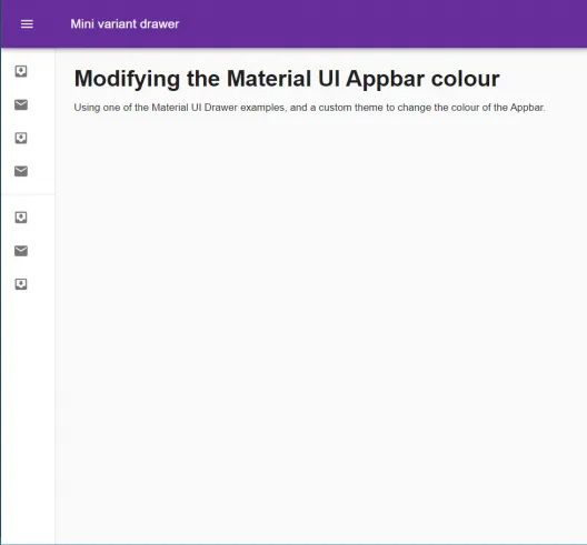
If you save your changes you should see your MUI Appbar background color change – that means the custom theme is being used!
The full code – appbar color example
import React from "react";
import clsx from "clsx";
import { ThemeProvider } from "@material-ui/core/styles";
import { makeStyles, useTheme } from "@material-ui/core/styles";
import Drawer from "@material-ui/core/Drawer";
import AppBar from "@material-ui/core/AppBar";
import Toolbar from "@material-ui/core/Toolbar";
import List from "@material-ui/core/List";
import CssBaseline from "@material-ui/core/CssBaseline";
import Typography from "@material-ui/core/Typography";
import Divider from "@material-ui/core/Divider";
import IconButton from "@material-ui/core/IconButton";
import MenuIcon from "@material-ui/icons/Menu";
import ChevronLeftIcon from "@material-ui/icons/ChevronLeft";
import ChevronRightIcon from "@material-ui/icons/ChevronRight";
import ListItem from "@material-ui/core/ListItem";
import ListItemIcon from "@material-ui/core/ListItemIcon";
import ListItemText from "@material-ui/core/ListItemText";
import InboxIcon from "@material-ui/icons/MoveToInbox";
import MailIcon from "@material-ui/icons/Mail";
import customtheme from "./style/theme";

const drawerWidth = 240;

const useStyles = makeStyles((theme) => ({
  root: {
    display: "flex",
  },
  appBar: {
    zIndex: theme.zIndex.drawer + 1,
    transition: theme.transitions.create(["width", "margin"], {
      easing: theme.transitions.easing.sharp,
      duration: theme.transitions.duration.leavingScreen,
    }),
  },
  appBarShift: {
    marginLeft: drawerWidth,
    width: `calc(100%% - ${drawerWidth}px)`,
    transition: theme.transitions.create(["width", "margin"], {
      easing: theme.transitions.easing.sharp,
      duration: theme.transitions.duration.enteringScreen,
    }),
  },
  menuButton: {
    marginRight: 36,
  },
  hide: {
    display: "none",
  },
  drawer: {
    width: drawerWidth,
    flexShrink: 0,
    whiteSpace: "nowrap",
  },
  drawerOpen: {
    width: drawerWidth,
    transition: theme.transitions.create("width", {
      easing: theme.transitions.easing.sharp,
      duration: theme.transitions.duration.enteringScreen,
    }),
  },
  drawerClose: {
    transition: theme.transitions.create("width", {
      easing: theme.transitions.easing.sharp,
      duration: theme.transitions.duration.leavingScreen,
    }),
    overflowX: "hidden",
    width: theme.spacing(7) + 1,
    [theme.breakpoints.up("sm")]: {
      width: theme.spacing(9) + 1,
    },
  },
  toolbar: {
    display: "flex",
    alignItems: "center",
    justifyContent: "flex-end",
    padding: theme.spacing(0, 1),
    // necessary for content to be below app bar
    ...theme.mixins.toolbar,
  },
  content: {
    flexGrow: 1,
    padding: theme.spacing(3),
  },
  overrides: {
    MuiAppBar: {
      colorPrimary: {
        backgroundColor: "orange",
      },
    },
  },
}));

export default function MiniDrawer() {
  const classes = useStyles();
  const theme = useTheme();
  const [open, setOpen] = React.useState(false);

  const handleDrawerOpen = () => {
    setOpen(true);
  };

  const handleDrawerClose = () => {
    setOpen(false);
  };

  return (
    <ThemeProvider theme={customtheme}>
      <div className={classes.root}>
        <CssBaseline />
        <AppBar
          position="fixed"
          className={clsx(classes.appBar, {
            [classes.appBarShift]: open,
          })}
        >
          <Toolbar>
            <IconButton
              color="inherit"
              aria-label="open drawer"
              onClick={handleDrawerOpen}
              edge="start"
              className={clsx(classes.menuButton, {
                [classes.hide]: open,
              })}
            >
              <MenuIcon />
            </IconButton>
            <Typography variant="h6" noWrap>
              Mini variant drawer
            </Typography>
          </Toolbar>
        </AppBar>
        <Drawer
          variant="permanent"
          className={clsx(classes.drawer, {
            [classes.drawerOpen]: open,
            [classes.drawerClose]: !open,
          })}
          classes={{
            paper: clsx({
              [classes.drawerOpen]: open,
              [classes.drawerClose]: !open,
            }),
          }}
        >
          <div className={classes.toolbar}>
            <IconButton onClick={handleDrawerClose}>
              {theme.direction === "rtl" ? (
                <ChevronRightIcon />
              ) : (
                <ChevronLeftIcon />
              )}
            </IconButton>
          </div>
          <Divider />
          <List>
            {["Inbox", "Starred", "Send email", "Drafts"].map((text, index) => (
              <ListItem button key={text}>
                <ListItemIcon>
                  {index %% 2 === 0 ? <InboxIcon /> : <MailIcon />}
                </ListItemIcon>
                <ListItemText primary={text} />
              </ListItem>
            ))}
          </List>
          <Divider />
          <List>
            {["All mail", "Trash", "Spam"].map((text, index) => (
              <ListItem button key={text}>
                <ListItemIcon>
                  {index %% 2 === 0 ? <InboxIcon /> : <MailIcon />}
                </ListItemIcon>
                <ListItemText primary={text} />
              </ListItem>
            ))}
          </List>
        </Drawer>
        <main className={classes.content}>
          <div className={classes.toolbar} />
          <Typography variant="h1" gutterBottom>
            Modifying the Material UI Appbar colour
          </Typography>
          <Typography paragraph>
            Using one of the Material UI Drawer examples, and a custom theme to
            change the colour of the Appbar.
          </Typography>
        </main>
      </div>
    </ThemeProvider>
  );
}
The theme file looks like this:
import { createTheme } from "@material-ui/core/styles";

const myTheme = createTheme({
  root: {
    display: "flex",
  },
  palette: {
    primary: {
      main: "#1987c9",
    },
  },
  typography: {
    fontFamily: "Lato, Arial",
    fontSize: 12,
    h1: {
      fontFamily: "Lato, Arial",
      fontSize: 30,
      fontWeight: 700,
    },
    h2: {
      fontFamily: "Lato, Arial",
      fontSize: 20,
      fontWeight: 700,
      paddingBottom: 20,
    },
  },
  overrides: {
    MuiAppBar: {
      colorPrimary: {
        backgroundColor: "#662E9B",
      },
    },
  },
});

export default createTheme(myTheme);