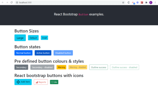
Do you want to know how to make your React Bootstrap buttons look good? React-bootstrap provides a library of components that will help you create beautiful, responsive UI’s. In this post I’ll explain how to use the Button component in a React website. You can quickly change the color of each button, and switch between flat and outline button styles. You can also adjust the React Bootstrap button size, and switch between each state (normal/active/disabled)! If you’re searching for ‘React Bootstrap icon button‘ then you’ll find a working example in this post, using both an image icon, and an icon from an icon library.
Table of contents
- Use Bootstrap with React
- React bootstrap button import
- Create a simple Bootstrap button in React
- Change the size of React Bootstrap button
- How to change the button color
- Create a Bootstrap button with icon
- Create an icon button with an SVG or PNG
- Handle the onClick event of the button
- Summary
- You may also like:
Use Bootstrap with React
I’ve written another blog post explaining how to use Bootstrap with React using the react-bootstrap package. I’d also recommend checking the official react-bootstrap site to check the version number you should be importing. Now to start working with the React Button component…..
React bootstrap button import
To use any Buttons in your page you need to import the Button object at the top of your page like this:
import Button from "react-bootstrap/Button";Create a simple Bootstrap button in React
To create the absolute simplest button in your React page using Bootstrap use this example code:
<Button>I am a simple button</Button> It is that simple – just an opening and closing Button tag, and the text between defines the label of the button. Bootstrap will presume default values for the size and color (blue).
Change the size of React Bootstrap button
So what if you want your button to be a different size to this? If we presume the default size is medium, there are two other sizes to easily use – small and large, as follows:
 <Button size="lg" variant="info">
   Large
</Button>
 <Button size="sm" variant="info">
   Small
 </Button>
How to change the button color
To change a the button color or behaviour, check the comprehensive react-bootstrap documentation and using the appropriate property for your needs as shown in these examples. For instance:
//change variant for success/info/primary/secondary etc to change the colour
<Button size="sm" variant="info">
  Ok
</Button>
Create a Bootstrap button with icon
Do you want to add an icon to a Bootstrap button? It’s really, really simple with bootstrap-react. You can use a graphic – a png or an svg for instance, or you can use an icon from any icon library. Here’s an example using an icon from the react-bootstrap-icons library (https://icons.getbootstrap.com/ ). To install the library type:
npm install react-bootstrap-icons --save.. and then to use an icon you have to declare it like this at the top of your file:
import { ArrowRight } from 'react-bootstrap-icons';… replacing ‘ArrowRight‘ with whatever icon name you are intending to use. So here is an example of a button with an icon using react-bootstrap:
//add at the top of your file to import the relevant icon
import { Heart } from "react-bootstrap-icons";

//add this where you want to put the button in the code
<Button size="lg" variant="info">
  <Heart /> Add item
</Button>
Create an icon button with an SVG or PNG
And what about using an svg or png image for the icon instead of an image library icon?
//add at the top of your file to import the relevant image
import addImg from "../src/img/add.svg";

//add this where you want to put the button in the code
<Button size="lg" variant="info">
   <img src={addImg} alt="add item" width="30" /> Add item
</Button>
If you want a little more information, read my post explaining how to use icons with Bootstrap in React.
Handle the onClick event of the button
To make the button do something we use the onClick property of the Button component. I’ve called the method handleClick, but you could call this whatever you want.
<Button size="lg" onClick={handleClick}>
  Take photo <CameraFill />
</Button>
Now add the method itself:
const handleClick = () => {
  //do stuff here
};
Download example buttons source code

You can access the full code to build all the examples in this blog post from my git repo – https://github.com/EmilyChristy/react-bootstrap-button-example
Summary
Now you know how to change the button size, and the button color. You know how to use an SVG or a PNG for a React-bootstrap icon button, and you know how to handle the onClick event of the button.
