Following on from my post about changing the Material UI Appbar background color, this is a tutorial on using Material UI Icons (MUI icons) in a React app. I describe how to change the MUI icon size and color, and how to add a hover style. Before we dive into the detail I’m presuming that you’ve created a React app already, so once you are ready to start focusing on using Mui icons in your Material UI React app you’ll need to install Material UI for React, and install Material UI icons (material-ui/icons), both of which I’ll discuss below.
Table of contents
Install Material UI for React
For this tutorial I’ll be using Mui, a component library for React using Material UI.
Use the following command to install the latest package to your React app, I’ll be using MUI v5.2.7 which is the newest version at the time of writing this post:
// with npm
npm install @mui/material @emotion/react @emotion/styled

// with yarn
yarn add @mui/material @emotion/react @emotion/styled
Install Roboto font
As per the documentation, Mui was designed with Roboto font in mind, but it isn’t installed automatically, so we need to do that now. There are several different ways of doing this but I’ll import it from a CDN for this tutorial. Add this to your index.html file above the Title tag:
<link
  rel="stylesheet"
  href="https://fonts.googleapis.com/css?family=Roboto:300,400,500,700&display=swap"
/>
Install a Material UI Icons package
I’ve said ‘a material UI icons package’ because there isn’t just 1, there are 3 different ways of using icons with Material UI. You can use any icon font, or SVG icon with material UI, but I’m going to explain how to use React Material icons library. It’s a library of 1300 icons made specifically to use with Material UI.
In order to use this package you need to install the Material UI npm package. Again, follow their instructions for the most up to date command, but you’ll need to use a command like this to install the package :
// with npm
npm install @mui/icons-material

// with yarn
yarn add @mui/icons-material
View and use Mui icons
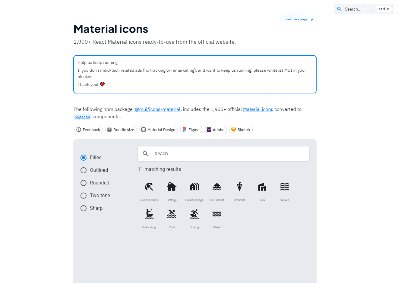
You can view the whole @mui/icons-material library of icons online. Once you’ve found the icon(s) you want to use, make a note of the name. You can search for icons, so let’s say you’re looking for an icon to do with a beach, you’d search here:

Import each Material UI icon
You can import each icon individually by using it’s name, and in VS Code, as you start typing the name within the curly brackets, you’ll see an autocomplete list come up of all of the available icons. So importing the BathroomICon icon would look like this :
import BathroomIcon from "@mui/icons-material/Bathroom";
Show the Mui icon on the page
Once you’ve imported the icon or icons that you need you’re ready to add them to the correct position in your page. To show the BathroomIcon in the page you’d simply reference it like this:
<BathroomIcon /> That’s the simplest example of how to use an icon in React using Material UI. It’s likely though that you’ll want to change the icon somehow. In Material UI each icon also has a ‘theme’, so most of the icons have variations as follows:
- Filled (default)
- Outlined
- Rounded
- Two-tone
- Sharp
To import the Mui Material icon component with a theme other than the default, use this code in your App.js file:
import BathroomIconOutlined from "@mui/icons-material/BathroomOutlined";
import BathroomTwoToneIcon from "@mui/icons-material/BathroomTwoTone";

//use them like this
<BathroomIconOutlined />
<BathroomTwoToneIcon />
Change the Icon color
The simplest way to change the color of the icon is to pass a direct style color property:
//using a hex value
<BathroomIconOutlined style={{ color: "#ffee66" }} />

//using a standard css colour
<BathroomTwoToneIcon style={{ color: "blue" }} />

//import a material ui colour, and use that
import { purple } from "@mui/material/colors";
<BathroomIcon style={{ color: purple[500] }} />
Change the React MUI Icon size
The simplest way to change the size of an icon is to use the fontSize prop, directly or in a style directive:
//using the fontSIze prop - small / medium / large
<BathroomTwoToneIcon fontSize="large" />

 //using the fontSize property in a style directive
<BathroomIcon style={{ fontSize: "60px" }} />
Change the hover color of a Material UI icon
In order to change the colour of the icon when you hover over it is done using css in the sx property. In this example we’ll use the BatterySaverTwoTone icon, so set the markup like this, including a colour for the normal state, and then a hover state color defined using the “&:hover” selector :
 <BatterySaverTwoToneIcon
  sx={{
      color: green[200],
        fontSize: "120px",
          "&:hover": { color: green[500] },
  }}
  />
In this example the normal color is green[200] and the hover color is green[500], where green is a color imported from Material UI like this :
import green from '@material-ui/core/colors/green';You should now find that the icon color changes when you hover over it!
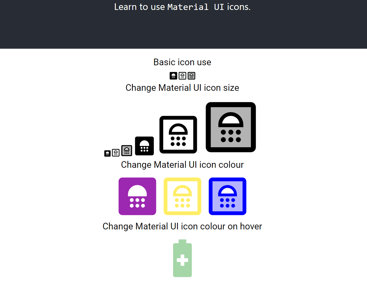
I’ve included the code that will give you a page with all the Material UI icons shown in the image below. This includes examples of different Mui icon sizes and colors, and an example of how to change the hover color of the icon.

The code for this MUI icons with React example is in my git hub repo.
FAQs
First of all go to the Material UI website icons page. Then install the MUI icons npm package. This presumes you already have Material UI installed in your project.
Use npm install @mui/material @emotion/react @emotion/styled if you use npm. Use yarn add @mui/material @emotion/react @emotion/styled if you use Yarn.
Use the fontSize prop like this <BathroomTwoToneIcon fontSize="large" /> or like this for even more icon size control: <BathroomTwoToneIcon style={{ fontSize: "60px" }} />
